As 2021 comes to an end and the new year is thwarding towards us a little dose of optimism and fresh stimulation may be just what we need while committing to a new set of goals and resolutions.
A New Pantone Color Whose Courageous Presence Encourages Personal Inventiveness And Creativity.
Displaying a carefree confidence and a daring curiosity that animates our creative spirit, inquisitive and intriguing PANTONE 17-3938 Very Peri helps us to embrace this altered landscape of possibilities, opening us up to a new vision as we rewrite our lives. Rekindling gratitude for some of the qualities that blue represents complemented by a new perspective that resonates today, PANTONE 17-3938 Very Peri places the future ahead in a new light.
Source: Pantone
What does color of the year even mean?
“The Pantone Color of the Year reflects what is taking place in our global culture, expressing what people are looking for that color can hope to answer.” added Laurie Pressman, Vice President of the Pantone Color Institute. “Creating a new color for the first time in the history of our Pantone Color of the Year educational color program reflects the global innovation and transformation taking place. As society continues to recognize color as a critical form of communication, and a way to express and affect ideas and emotions and engage and connect, the complexity of this new red violet infused blue hue highlights the expansive possibilities that lay before us”.
Source: Pantone
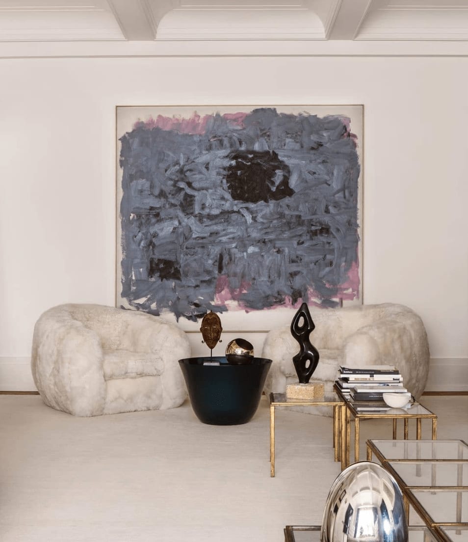
Photo source: Larry’s List
For 23 years, Pantone’s Color of the Year has influenced product development and purchasing decisions in multiple industries, including fashion, home furnishings, and industrial design, as well as product packaging and graphic design.
Source: Pantone
Through seasonal trend forecasts, color psychology, and color consulting, Pantone Color Institute partners with global brands to effectively leverage the power, psychology, and emotion of color in their design strategy.
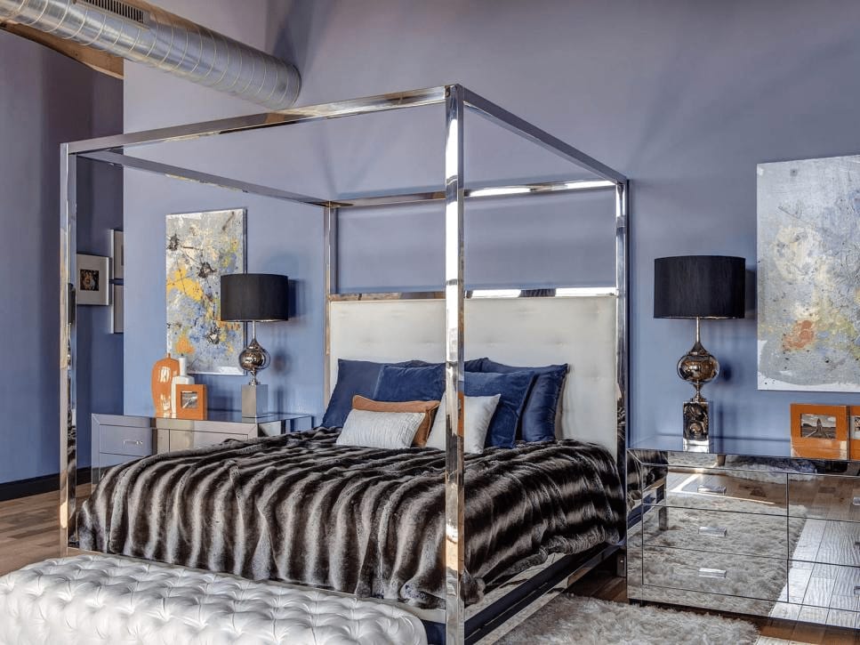
Photo source: Pinterest
Periwinkle has many of the same meanings and associations as general light blue tints, such associations as freshness, cleanliness and tranquility. It also has a very slight hint of violet, which adds a little uniqueness, intuition, compassion and magic into the mix.
Source: colorpsychologymeaning.com
To arrive at the selection each year, Pantone’s color experts at the Pantone Color Institute™ comb the world looking for new color influences. These can include the entertainment industry and films in production, traveling art collections and new artists, fashion, all areas of design, popular travel destinations, as well as new lifestyles, playstyles, and socio-economic conditions. Influences may also stem from new technologies, materials, textures, and effects that impact color, relevant social media platforms and even upcoming sporting events that capture worldwide attention.
Source: Pantone
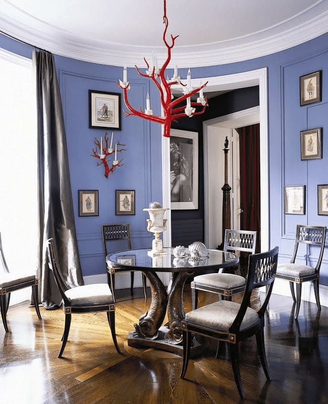
Photo source: Home Style
Fun Fact
Periwinkle gets its name from the flower (Vinca Minor) which can be found in some central and southern European countries, as-well as some parts of Asia. Records reveal that 1922 was the earliest date that the name periwinkle was assigned to the color.